Design My Own Art
and
Film Project
I got my idea for this project at the glimpse of the Durango Film Festival that Animas held for its students. There was a video of one line people walking around and I found the animation to be both interesting and likely challenging to create. So with that video in mind, I started drawing. I wanted to make the video primarily seem like it was a one-line drawing that turned into images in order to create the effect of continuity. Originally I was planning on just doing a biker, and then from there, I began to think, what does biking make me feel. At first, this was just to tie a certain amount of emotion into the drawing, and in my search for the proper word I decided that the answer was flying: biking made me feel like I was flying. And so, using that incite I created the bird and sought to tie that into the idea I already hand, creating the video you see.
I chose to create this for two reasons: a) I like to be challenged and this looked like it would supply a challenge and b) I wanted to express one of the more important aspects of my life right now, biking. As the people who know me might have heard me say once or twice before, I don’t view myself as an artist, at least not in the usual way. I don’t often find beauty in useless, brightly colored knick-nacks, made to be seen but not used. I find beauty in practicality and work well done. I find beauty in being outside, and I find beauty in speed. Of course, this means that I am greatly drawn to fast cars, who isn’t, but it also means I am drawn to sports where you reach great speeds: skiing, skating, and biking. What do all of the said sports have in common for me? In all of them, the moment you are going at your hardest and fastest is the moment that you are flying. Through this process, I learned how to make a stop animation/ flip book animation and I worked on my video editing and drawing skills, which is always good.
I chose to create this for two reasons: a) I like to be challenged and this looked like it would supply a challenge and b) I wanted to express one of the more important aspects of my life right now, biking. As the people who know me might have heard me say once or twice before, I don’t view myself as an artist, at least not in the usual way. I don’t often find beauty in useless, brightly colored knick-nacks, made to be seen but not used. I find beauty in practicality and work well done. I find beauty in being outside, and I find beauty in speed. Of course, this means that I am greatly drawn to fast cars, who isn’t, but it also means I am drawn to sports where you reach great speeds: skiing, skating, and biking. What do all of the said sports have in common for me? In all of them, the moment you are going at your hardest and fastest is the moment that you are flying. Through this process, I learned how to make a stop animation/ flip book animation and I worked on my video editing and drawing skills, which is always good.
LOGO PROJECT
|
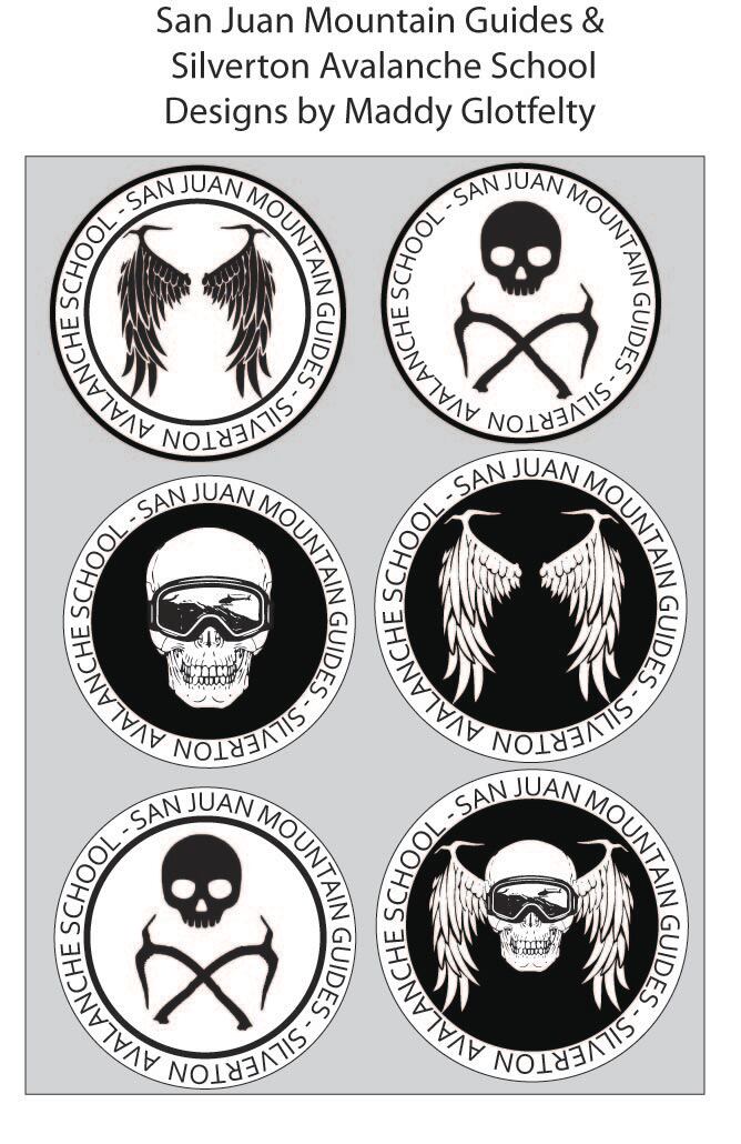
We started this project by attempting to learn the necessary basics that we would need to create the logos. This was, as it turns out, significantly more difficult than it was to learn photoshop because we had all the skills to do this project in photoshop making Illustrator seem slightly pointless to learn. This being said, we were encouraged to do it anyway, and with that encouragement we started the real project. I chose to do the project extension and work with the FBI Tactical Unit to create a logo. We started by doing sketches, then moved our ideas into illustrator and created a sheet with multiple possible logos (as seen on the left), finally finishing by incorporating one of the logos onto merchandise.
It was extremely important to make sure that the logo we created was eye catching, as is true with all logos. If the logo doesn't catch your eye then it isn't fulfilling the purpose of a logo. This is perhaps most easily noticed in the realm of advertising because if it isn't catching their eye it isn't selling the product. I tried to keep my designs as classic and timeless as possible. Something that will be just as cool in fifteen years as it is right now and might have been in the past. This is important because logos can last for multiple years beyond the time when it was first created and you still want the logo to hold value as time goes on. I had previously been introduced to Adobe Illustrator before this project, but I'll be the first to admit that I didn't retain very much of the information from that short glimpse into this program. That being said, I feel like I learned a lot about Illustrator that I had previously never known. The most prominent skills I gained in Illustrator that I hadn't known before was 1) how to properly use the pen tool 2) how to live trace and 3) how to . manipulate images and objects in Illustrator. |
TEACHER CREATURE
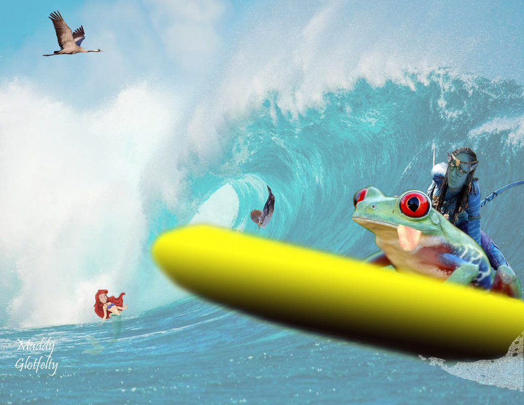
I have grown a lot within my ability to use photoshop throughout this semester. For example at the beginning of the semester, I would not have been able to effectively apply Roxy's face onto the avatar, or Tina's face onto Ariel. I definitely would not have been able to cut out the frog or the Blue Avatar. When I first started the semester my abilities barely able to insert an image into into photoshop much less use that image to add add layers onto an image.
Original Images
Headers Project
In today’s digital landscape—more than ever—people are aware of typography, design and how the world looks around them. Gary Hustwit records this in Helvetica, a documentary about how fonts affect our everyday lives. Most notably, Helvetica ushers in the larger conversation about global visual culture, detailing how and why people are progressively more mindful about the visual impact of design.
“THE WORLD IS FULL OF BEAUTIFUL FONTS—CHOOSING THE RIGHT ONE FOR YOUR NEXT PROJECT CAN BE A DAUNTING TASK.”
When working with a digital marketing agency, it is important to be prepared to discuss fonts during the creative process. And you may hear terms like sans serif, slab serif, or script—but this isn’t a bunch of mumbo jumbo, it’s science!
In my headers project I did not use images for any header except my final draft, so of course I won't have an original image for any of the others, but I did make multiple drafts for each class which can be seen below.
Original Image For All Final Drafts
Final Project Above
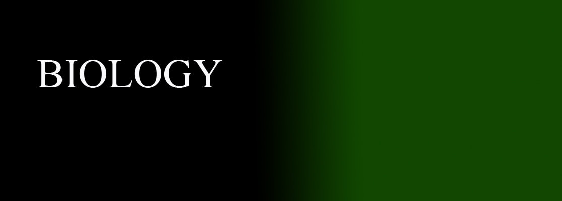
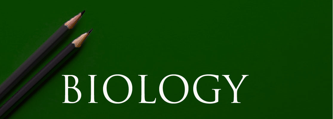
Biology
Draft 1

Draft 2
Draft 3
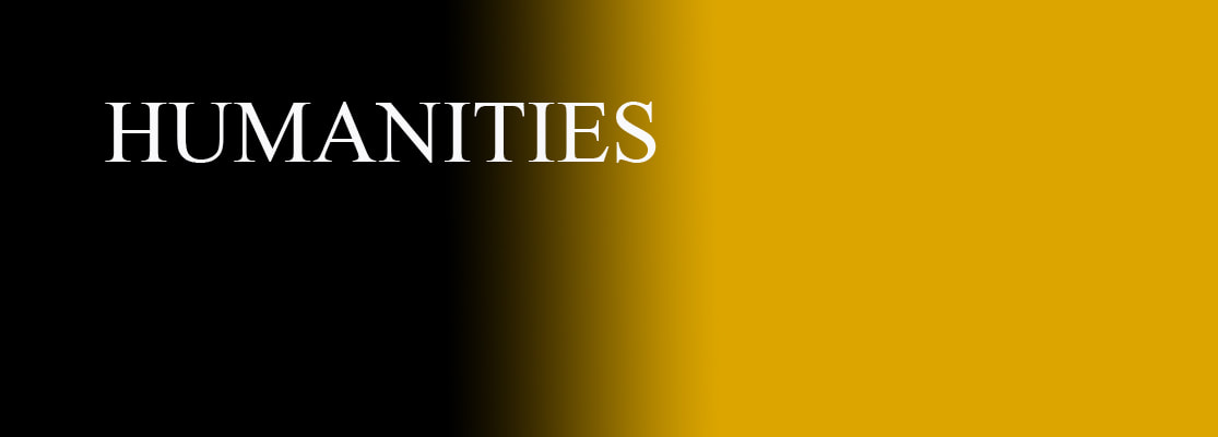
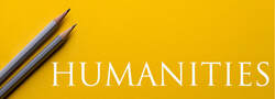
Humanities
Draft 1
Draft 2

Draft 3
Tutorials
|
|
|


|
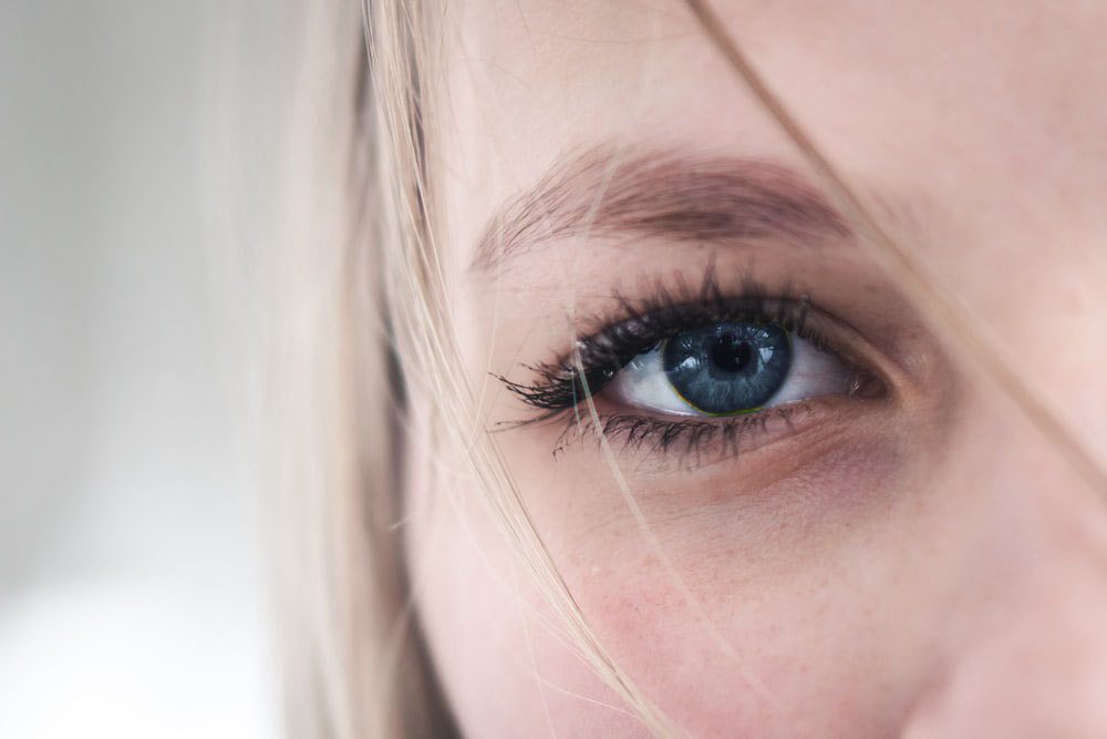
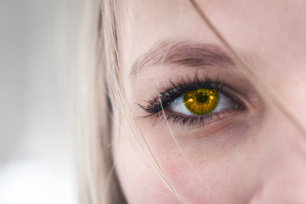
Original Image Photoshopped Image
I started this tutorial with outlining the iris of the eye with the pen tool. Then I right clicked inside of the pen tool selection and went to Make Selection to create a feather radius. I then pressed Ctrl U which brought me to the hue bar. I then messed with the hue until I got the golden color of the completed image. 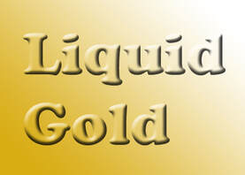
This photo is both the original and photoshopped version, because I made this entire image in Photoshop. I started by pressing the gradient tool and, finding a color I liked, making the gradient. I then went to the type tool and typed liquid gold, changing the size and font as I wanted. I then went to go fx section below my layer selection bar. Then go to Blending Options-- Bevel and Emboss. Change your bevel and emboss to whatever you like. Then go back to fx-- Blending Options-- Drop shadow, change to whatever you would like and then change the opacity of your letters to whatever you want.
|
Original Image Photoshopped Image
I started this tutorial by outlining the canine of the smiling women, after zooming in on the tooth using Ctrl + or -. I then outline the canine with the pen tool. Then I right clicked inside of the pen tool selection and went to Make Selection to create a feather radius. I then go to Layer Layer Via Copy. Once this is done, you go to Edit-- Transform-- Warp and warp it until the tooth looks like a fang. Repeat on the other side.
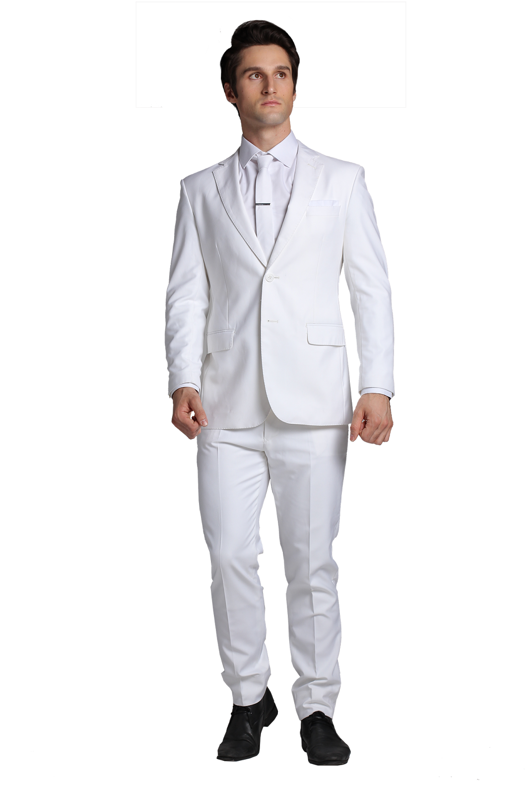 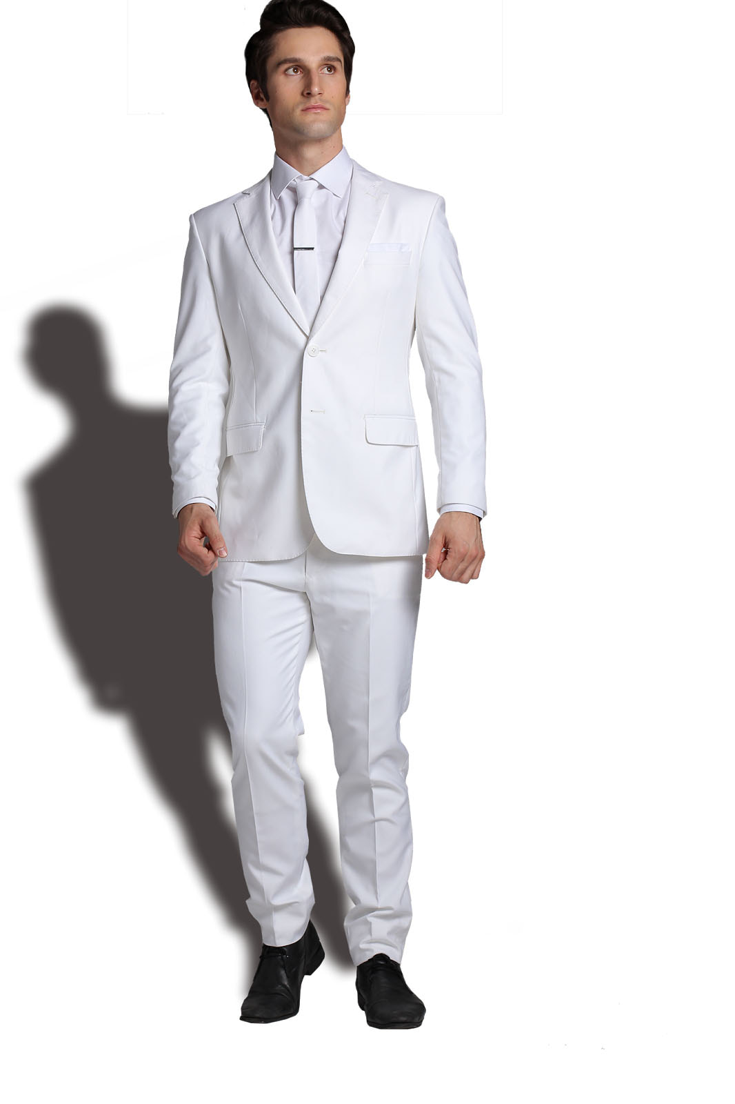 Original Image Photoshopped Image
Go to fx section below my layer selection bar. Then go to Blending Options-- Drop Shadow. You should be able too adjust the strength of the drop shadow. Then with the drop shadow selected go to Layer-- New Layer-- Layer via Copy. This should disconnect the drop shadow from the original image. Then go to Edit-- Transform-- Warp. Manipulate the shadow unit it looks like a realistic shadow. |
Original Image Photoshopped Image
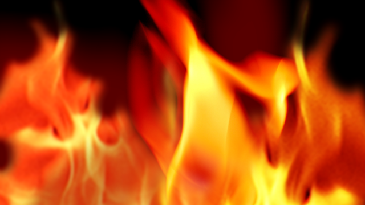
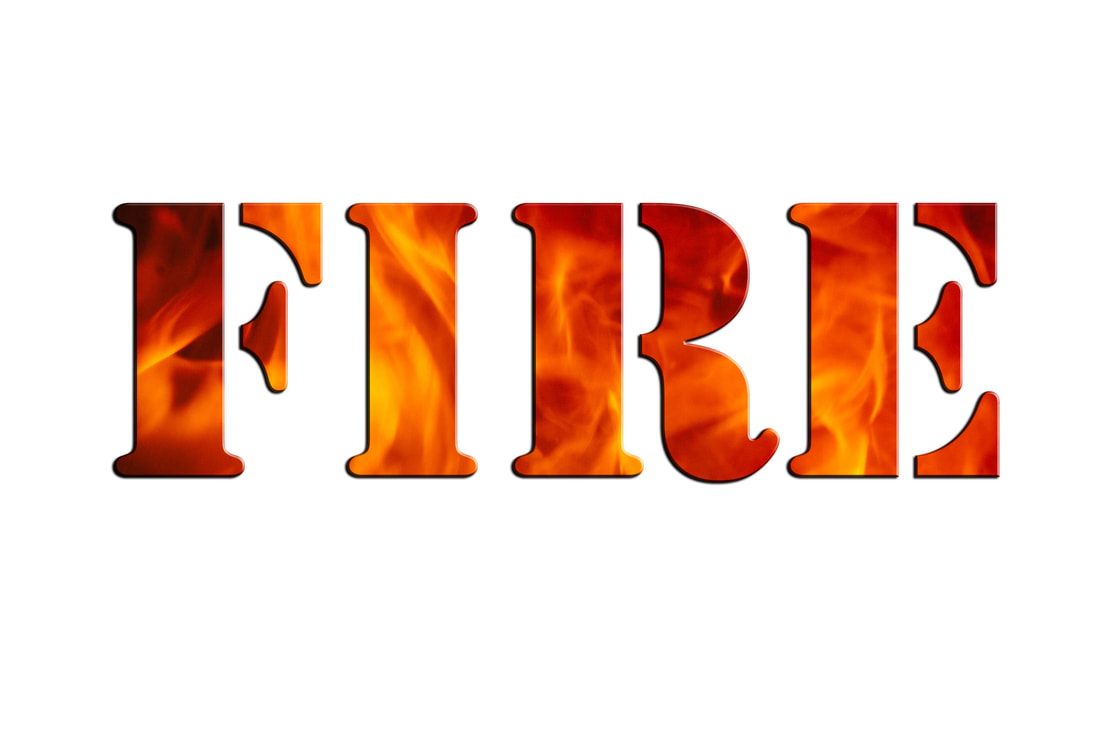
I started this project with a photo of fire. You then make a new layer and used the Text Tool to write your chosen word. I chose fire because of my obvious theme here. Change the font and size until you like it. Then hold alt and press the line in between the two layers. This should make a mask.
I started this project with a photo of fire. You then make a new layer and used the Text Tool to write your chosen word. I chose fire because of my obvious theme here. Change the font and size until you like it. Then hold alt and press the line in between the two layers. This should make a mask.
